
Design Your Wedding Photography Website: Part 1 - Color

So, you want to level up your website and ensure it’s polished, professional, and ready to market for your business? You’re in the right place!
Welcome to my blog series on designing your professional wedding photography website!
We begin our series by discussing color and how to use your brand colors on your website.
Before we jump in, I want to share a quick disclaimer. I am not a brand specialist. This blog post is not about choosing your brand colors.
If you’re looking to establish your brand palette, I recommend consulting with a branding expert.
This blog is about how to use your established brand colors on your website.
Alrighty - with that out of the way, let's dive in! This is going to be so fun!
Color Psychology
We’ve all heard of color theory before — primary, secondary, and tertiary colors and how they interact. I believe color psychology is more important to marketing and branding, so today, we’re going to start with color psychology.
Color psychology is the study of how colors make us feel. Because it can influence decision-making, it plays an important role in design!
Let’s begin with the root of color psychology in marketing - the colors themselves.
Color
RED: Red is a strong and bold color. It evokes passion, excitement, urgency, and sometimes danger.
ORANGE: Orange is a bold color that pops off the screen and draws the eye. It evokes playfulness, energy, and fun.
YELLOW: Yellow is an attention grabber. It evokes warmth, happiness, energy, positivity, and cheerfulness.
GREEN: Green is reminiscent of wealth and nature. It evokes feelings of growth, stability, reliability, and lasting quality.
BLUE: Blue is peaceful. It evokes safety, security, and trust. It can also be energizing.
PURPLE: Purple gives off a feeling of sophistication and luxury. It can evoke feelings of creativity, imagination, mystery, and elegance.
BROWN: Brown is natural and reliable. It evokes warmth, security, maturity, and dependability.
WHITE: White is a sleek, clean color. It evokes simplicity, cleanliness, minimalism, and openness.
GREY: Grey is versatile. It pairs well with most brand colors and evokes sophistication, classiness, and practicality.
BLACK: Black is the color of power. Black evokes strength, boldness, luxury, and exclusivity.
All of these colors can be divided into warm, cool, and neutral.
Warm colors are based in red, orange, yellow, brown, and tan.
Warm colors are often known as the “attention grabbers,” especially in their bold, saturated shades.
Bold warm tones make individuals feel passion, excitement, urgency, and joy.
Soft warm tones can feel comforting, peaceful, and welcoming.
Cool colors are based in green, blue, purple, and grey.
These are the calming colors.
Cool colors help people slow down and reduce overwhelm.
Cool colors also encourage careful, thoughtful decision-making.
Neutral colors are greyscale colors ranging from white to black. They also include muted shades - such as beige, ivory, and cream - that don't evoke strong emotions.
Neutrals are essential in every website color palette and help create balance.
Brands that want to feel timeless, modern, and professional will primarily choose neutral colors.
You can have a warm or cool tone neutral palette.
Keep reading … ⬇️
Different Color Styles in Web Design
Now that you understand the basics of color psychology, let’s talk about how they play into your website.
I know reading something is different than seeing something, so I created over 40 website mock-ups for this blog (although not all made the cut).
Please note — they were designed only to show how color is used. Many are bolder and brighter than you may prefer. They’re bare bones at best … no design or copywriting judgment, please! ;)
The use of color on your website will greatly change the vibe and feel of your brand.
If you want your website to feel:
Timeless
Elegant
Sophisticated
Classy
Clean
Then you will want to use primarily neutral colors.
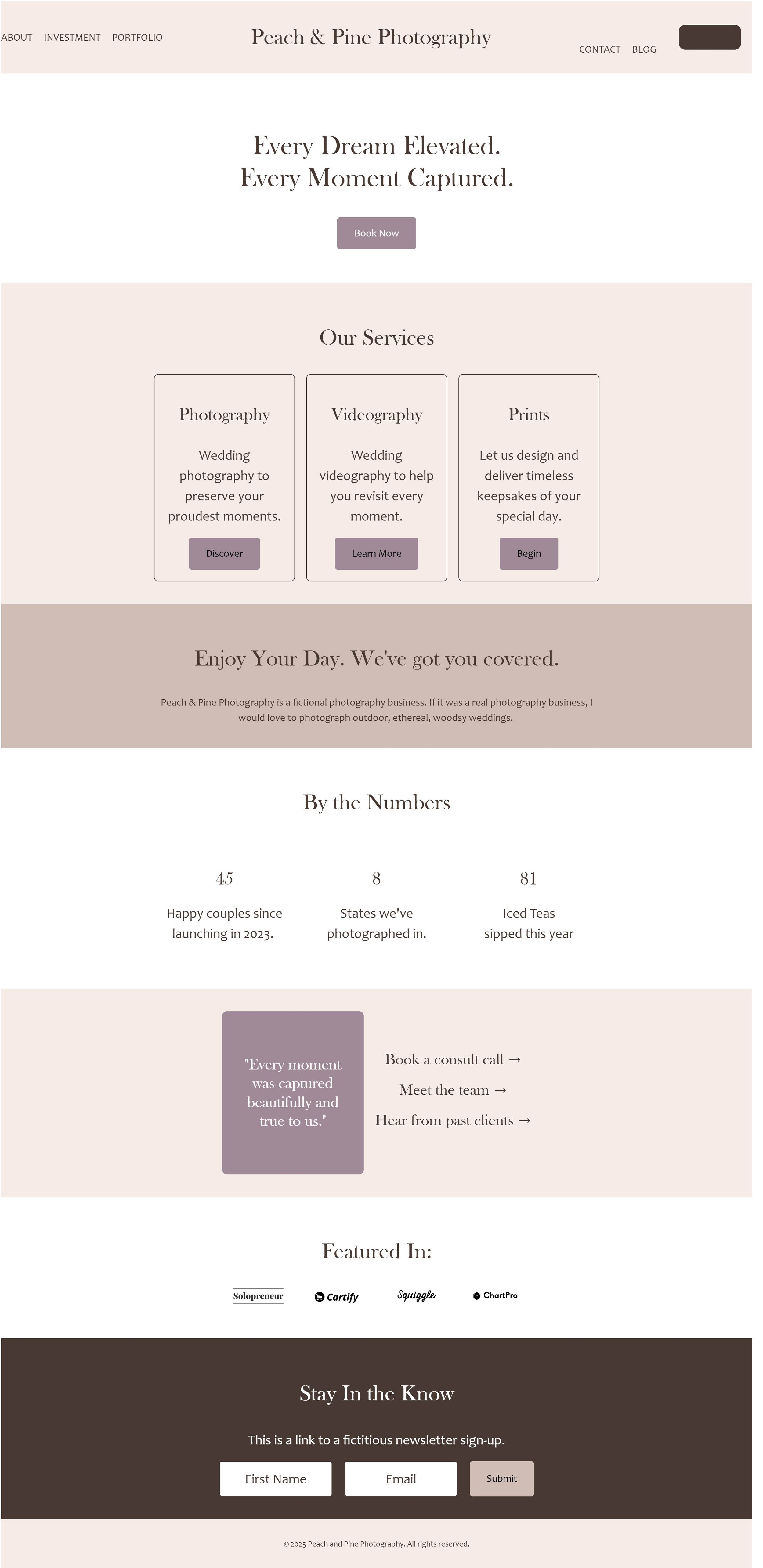
These are two examples of website mock-ups created with neutral color palettes.

Neutral color palette with cool tones.

Neutral color palette with warm tones.
If your brand color palette includes saturated colors but you want a sophisticated feel to your website, the best option is to use your bright colors as accents.
This can be especially helpful when you want to draw attention to specific blocks on your website, such as Call To Action buttons.
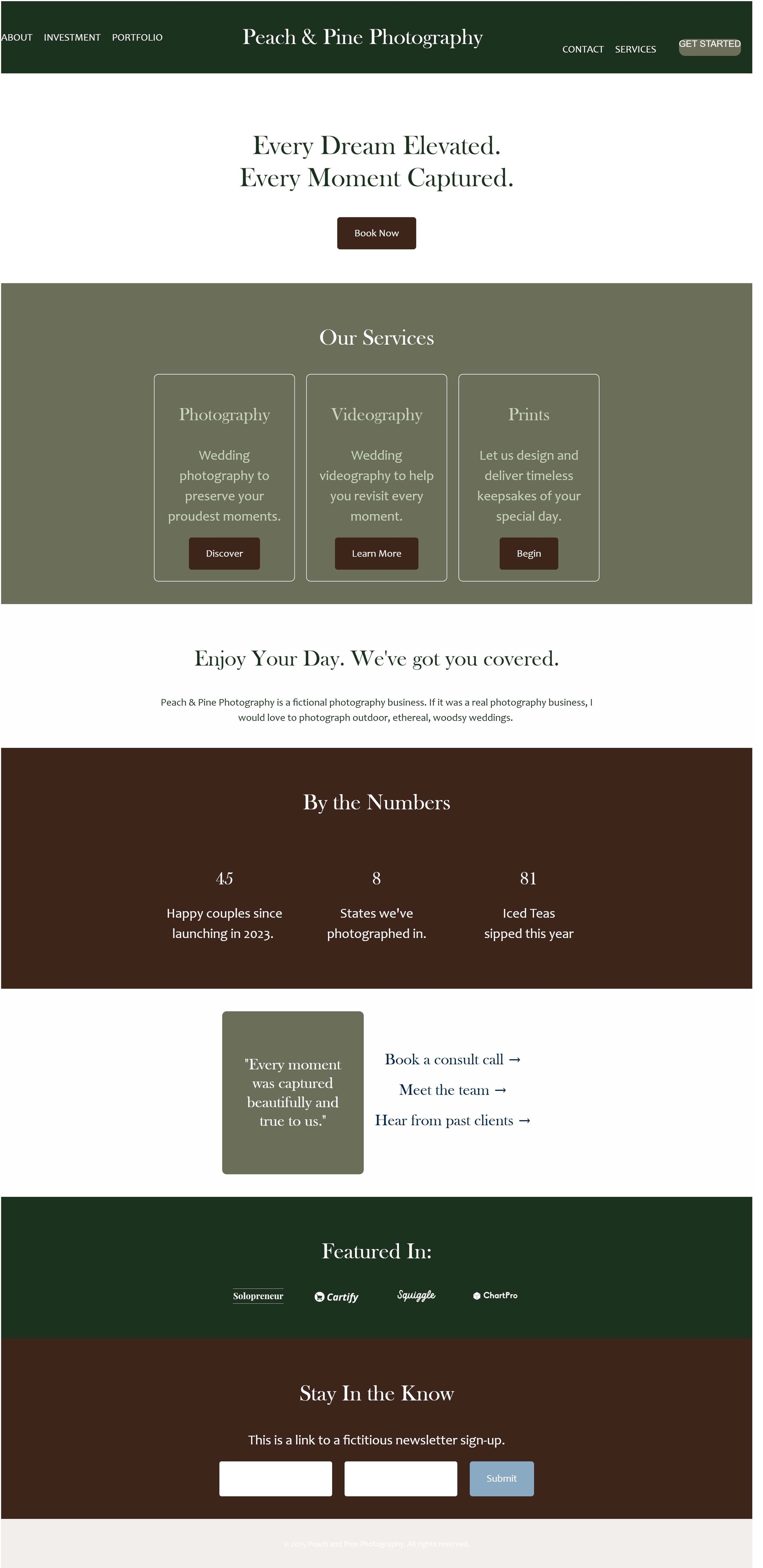
In these examples, you can see I kept the same neutral color palette as above but added pops of color.

Neutral color palette with cool tones and one accent color (blue).
Neutral color palette with warm tones and one accent color (mauve).
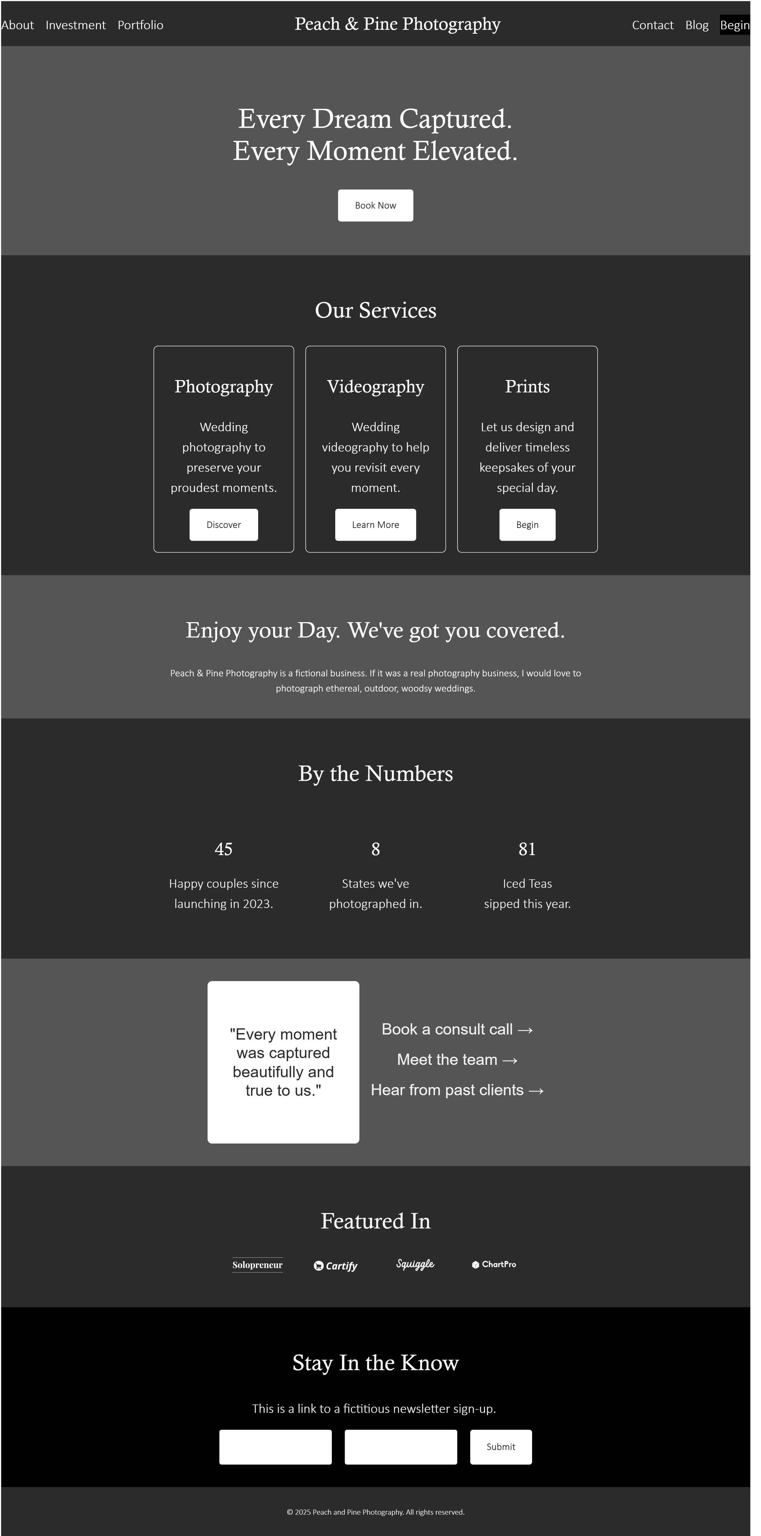
If you have a primary color in your palette that you’d like to feature more prominently on your website, a monochrome palette is a great way to do this.
Here are a few examples of websites that utilize monochrome color palettes while still feeling classy. Pay close attention to how each website makes you feel – isn’t that color psychology fascinating?

Monochrome color palette (seafoam green).

Monochrome color palette (ocean blue).

Monochrome color palette (royal purple).

Monochrome color palette (golden yellow).
Now, you may have a very specific vibe associated with your brand and need/want more colors incorporated into your website to match your branding. This can be especially true if your brand is known to be loud, flashy, bold, or bright. Here are examples of websites that use very distinct color combinations. It may not be your style, but we can definitely agree they’re memorable!


Ultimately, the route you choose will depend on the overall vibe you want your website and brand to convey.
If you’re unsure where to start, I recommend you start with a neutral color palette and lightly incorporate pops of color that tie into your branding.
Choosing Neutrals for Your Website Color Palette
If your color palette doesn’t have many neutral colors, you can select neutrals for your website. Keep in mind that some website builders have a maximum number of colors for use on your website. For example, Squarespace allows 5 colors total (including white and/or black) as the primary color palette. These colors determine your website’s general page styles (section backgrounds, buttons, text, etc.).
When choosing your colors, remember:
You want a mix of light and dark colors throughout your palette.
Some of your colors need to be high contrast so your text will stand out (and be WCAG compliant - more on that below!).
First, determine if you prefer a warm or cool color palette for your neutrals.
Consider if warm or cool colors will match better with your existing palette.
Consider the color psychology behind warm and cool colors.
Feel free to look at the mock-ups again; which feels better for your brand?
To determine the actual colors, you have a few different options.
You can play with colors yourself, adding different warm or cool colors to see what you like best.
You can use search engines like Google or Pinterest (yes, Pinterest is a search engine!) to look for examples of color palettes that already incorporate your existing colors.
You can use color palette tools to select colors.
I love The Color Palette Pro by The Color Palette Studio! While this is a paid tool, it’s super fun to play around with and has so many amazing features to help you with your color design (stay tuned for examples of some of those features, below!) Those are both affiliate links - enjoy 10% off on me!
If you’re looking for a free option, Coolers has a free color palette builder. Add your colors and then have fun experimenting!
You can reach out to your branding specialist for his or her opinion!
You can speak to a web designer for his or her thoughts! (Want my thoughts? I’m flattered! Send me a message!)
Using Colors on Your Website
Now that you’ve determined your colors, the fun begins!
Let’s start with a few general guidelines to follow when you’re designing your website.
No Plagiarism
This one shouldn’t need to be said, but here’s a reminder just in case… It’s okay to look at other websites and businesses for inspiration, but never copy their colors, layout, or design. Not only can this land you in (legal) hot water, but you want your website to stand out and be original!
ADA Compliance
Make sure your colors are WCAG (Web Content Accessibility Guidelines) compliant for website accessibility. This means your text and background colors need to be high contrast. There are specific requirements for headings vs. body text, but for simplicity’s sake - keep your contrast score at 4.5 or above. The higher the better.
My favorite tool for checking color contrast is The Color Palette Tester by The Color Palette Studio. Those are both affiliate links - go check them out and get 10% off on me!
They also have a basic, free tool called The Color Contrast Checker. This tool is a little more time-consuming and doesn’t have as many features, but it will do the job just fine, too!
Differentiate Your Sections
You want to differentiate between one section and the next on your web pages. For example, a services section followed by a testimony on your website should be distinguishable. One way to do this is by adding a line, border, or image(s) between the sections. You can also easily do this by changing the background color. You can look at any mock-ups in this blog to see how color changes demonstrate a new section.
Examples
Because I’m a little extra, I had to include more examples!
Each example demonstrates how one color palette (containing 5 colors) can be used in different ways to create unique styles and vibes on your website, from minimalistic and professional to bold and bright!
I mentioned The Color Palette Pro and The Color Palette Tester earlier (those are affiliate links again) … both tools let you input colors and will tell you what color combinations from your palette are WCAG compliant. They will also provide a nifty little chart of each color combination so you can easily see the pairings! Eek - it just makes my perfectionist heart so happy!
The Color Palette Pro is a “pick your own colors” style of palette building with plenty of guides to help you. It is fun if you like “getting messy” and doing it yourself! It even uses AI to assign the colors fun names, based on themes you put in!
The Color Palette Tester uses AI to choose colors for you after you input a prompt. You can then edit those colors as desired. This tool is great if you rather have a palette created for you, or just want to quickly test your own palette!
The examples below show screenshots from The Color Palette Pro of each color palette I inputted into my mock-ups and the WCAG-compliant pairings. The Color Palette Tester produces very similar results (they’re just styled slightly differently).
Example 1: Light & Cool Neutrals
This example focuses on cool neutrals that are primarily lighter colors. Notice how the darker shades can be used as accent colors!
Color Palette:

WCAG-Compliant Pairings:
Did you see the contrast noted for each pairing? **chef’s kiss** I love The Color Palette Pro!


Example 2: Dark & Cool Neutrals
This example uses a very similar color palette to the one above, just there are primarily dark colors, and the lights are used as accents!
Color Palette:

WCAG-Compliant Pairings:


Example 3: Beach Vibes
This example demonstrates how one accent color (blue) can be used differently, depending on if you want your website palette to be primarily neutral or more color-saturated.
Color Palette:

WCAG-Compliant Pairings:


Example 4: Pretty Purples
As above, this example demonstrates how one accent color can be used minimally or be more present throughout the website. This example also shows how you can change the overall tone of your website (light or dark) by playing with your neutral colors.
Color Palette:

WCAG-Compliant Pairings:


Example 5: Gorgeous Greens
This color palette shows how a monochrome palette can create very different styles.
Color Palette:

WCAG-Compliant Pairings:


Example 6: In the Vineyard
This final example shows how you can have two accent colors (olive and mauve) and use them together in many different ways!
Color Palette:

WCAG-Compliant Pairings:


Bring It All Together
In summary, the colors you choose for your website - and how you choose to use them - will greatly impact the overall style and vibe.
As this blog post is about how to use colors for a professional website, let me give you my tips based on current styles.
Keep your palette neutral-focused, unless you’re very confident in your color design skills or have a bold brand.
Stick with lighter neutrals for an elegant, clean feel. Think white, ivory, cream, beige, and pale grey. Then, use a dark neutral or accent color for contrast.
Use this as your basic template for a color palette with 5 colors:
3 light to medium neutrals
1 accent color
1 dark neutral
If any mock-ups in this post resonated with you, use it as a baseline, then make it your own!
There you have it! I hope this post was helpful to you as you determine just how to use your brand colors on your website. I definitely had fun writing it and creating all of the examples! (Total mock-up tally in this blog post: 30!)
If this feels too complicated, overwhelming, or time consuming, I’d love to visit with you about designing your website for you. Let me handle the design so you can dedicate your valuable time to what matters.
If you’re interested in a professional, custom web design, learn more about my Peach and Pine Experience or schedule your complimentary consultation.
As always - I’m cheering for you!
Kylee
Don’t want to miss when a new blog post gets shelved?
Join my inbox community and receive the Peach and Pine Post, a twice-monthly newsletter with links to recently published blog posts plus tips, tricks, and insider info about marketing, SEO, web design & strategy, copywriting, managing a small business as a real human being, and so much more! See you there!